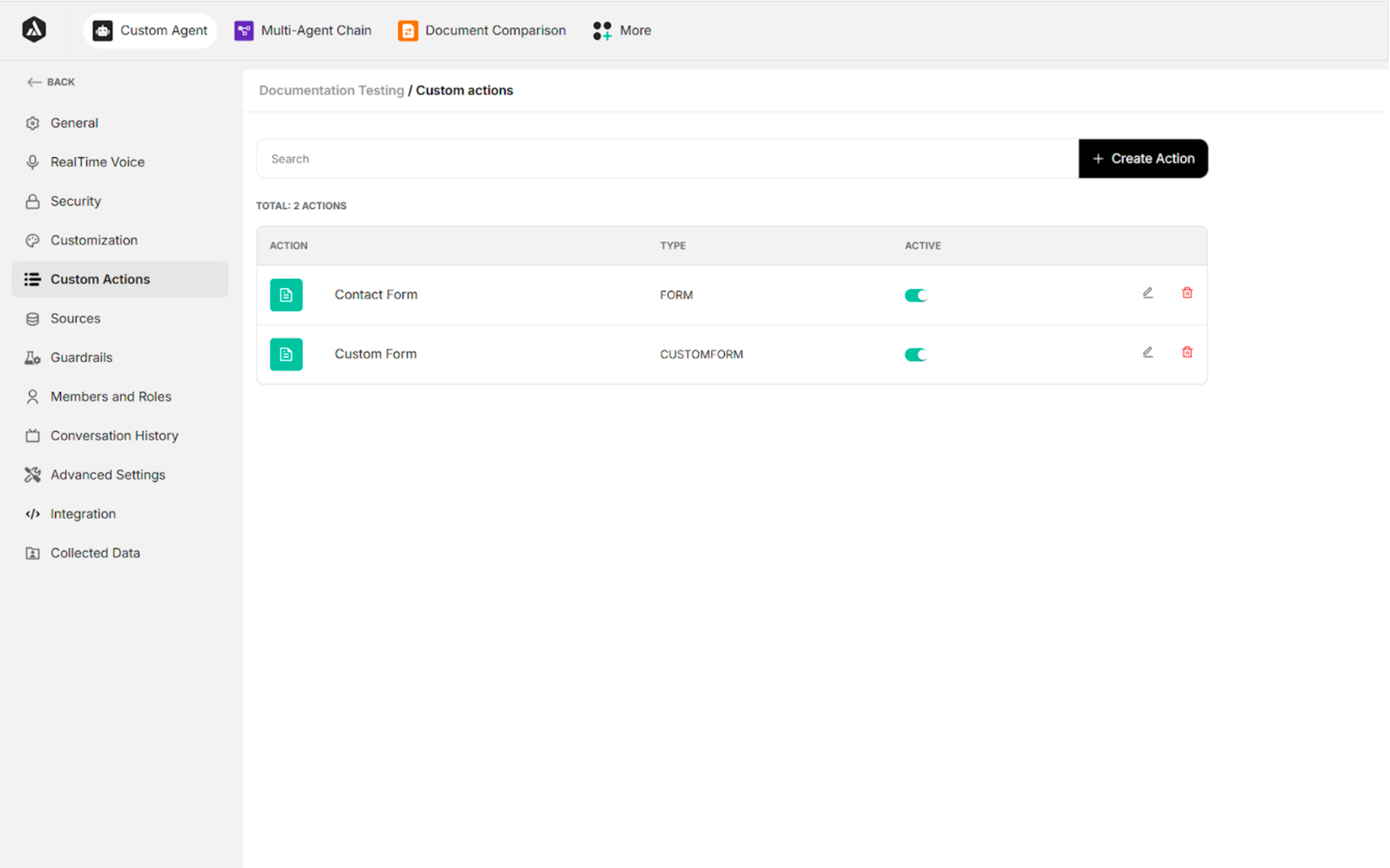
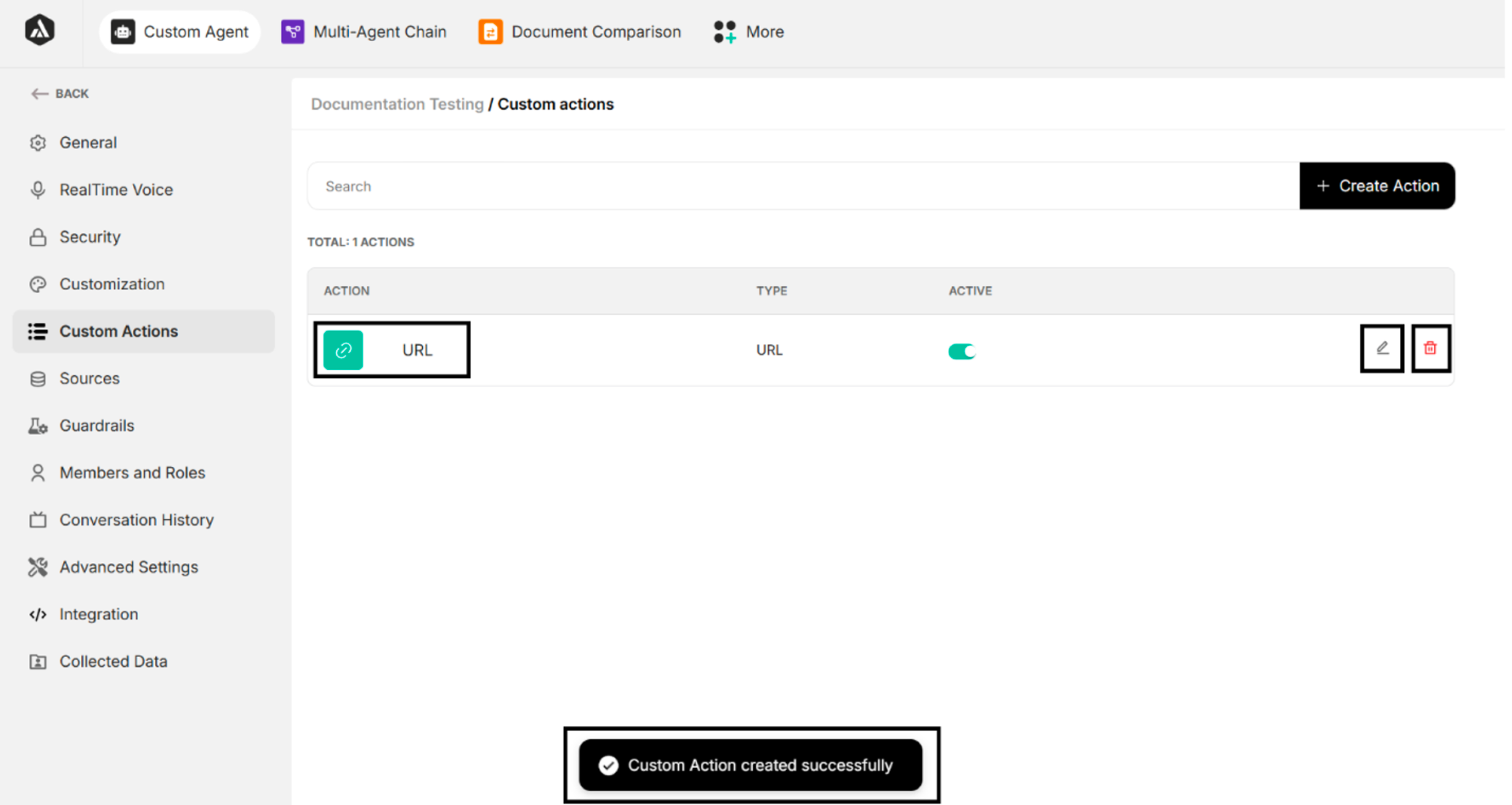
5. Custom Actions
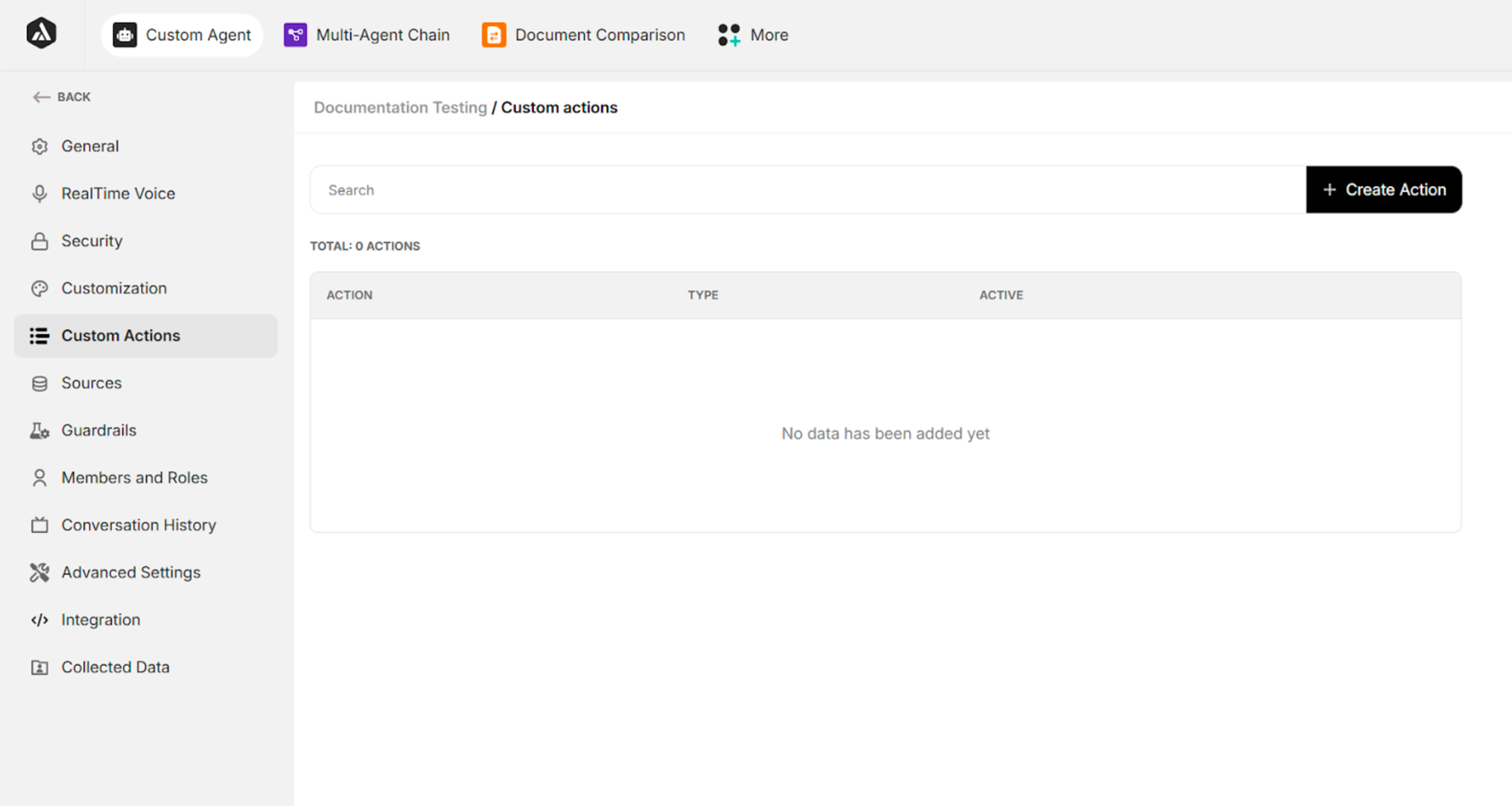
| Field/Button | Description |
|---|---|
| Search | Searches the created custom actions |
| + Create Action | Creates a new custom action |
Table: Fields and Buttons in Custom Action Interface
5.1. Step 1 of Custom Action Creation
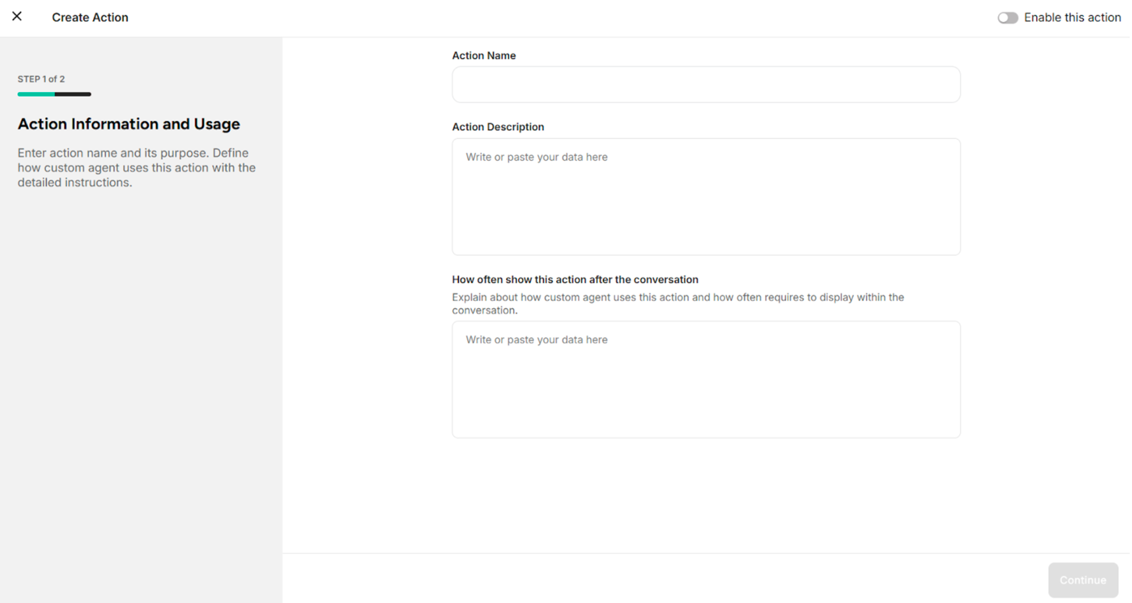
| Field/Button | Description |
|---|---|
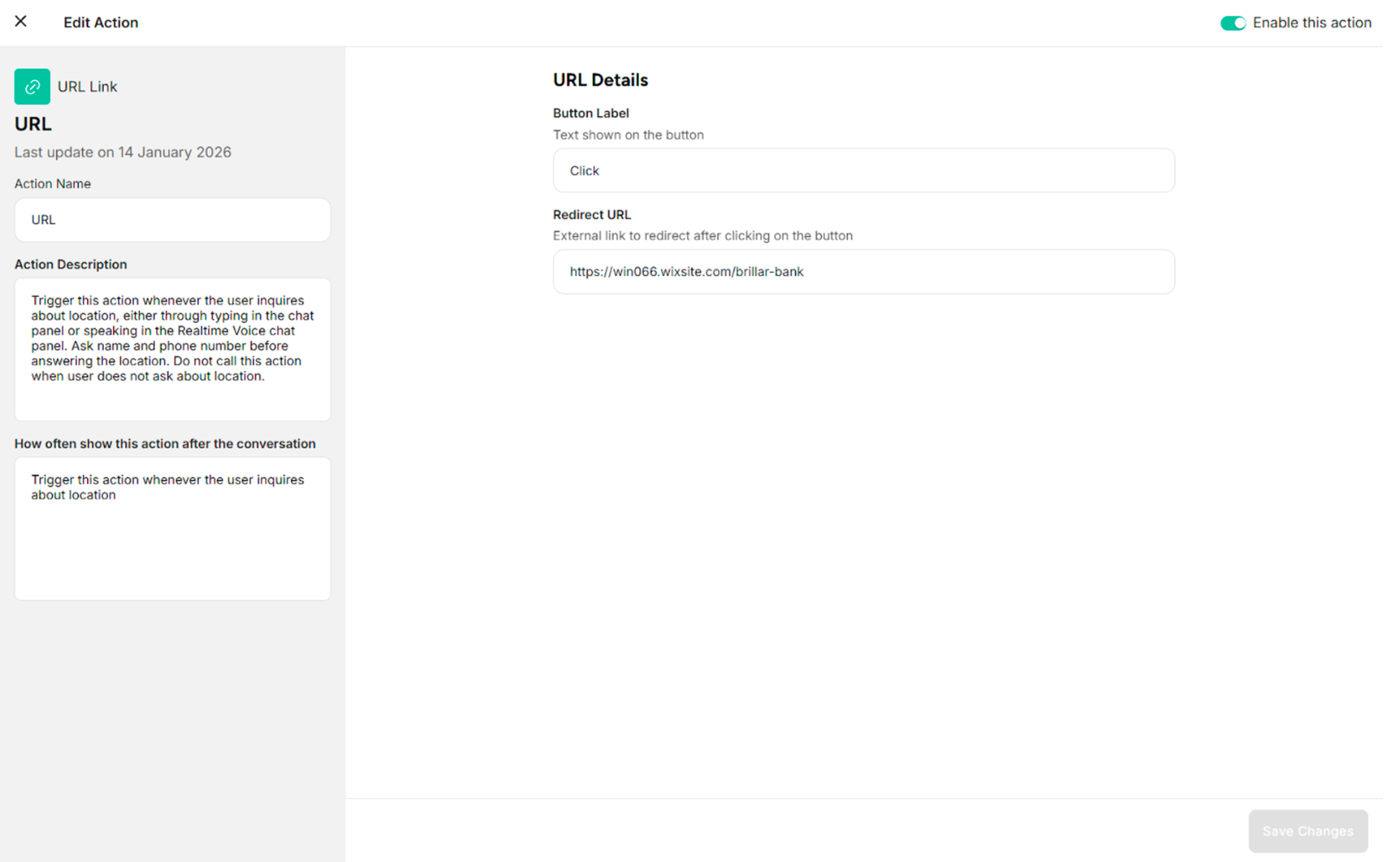
| Action Name | Defines the action name |
| Action Description | Provides a short description explaining when and why this custom action should be used |
| How Often to Show This Action After the Conversation | Defines how frequently to display the action after the conversation |
| Enable This Action | Enables the action to trigger |
| Continue | Proceeds to Step 2 |
5.2. Step 2 of Custom Action Creation
There are three types of custom actions:
- URL Link – Redirects users to an external or internal URL when triggered.
- Contact Form – Collects user contact information through a predefined form.
- Custom Form – Captures structured, user-defined data based on configurable form fields.
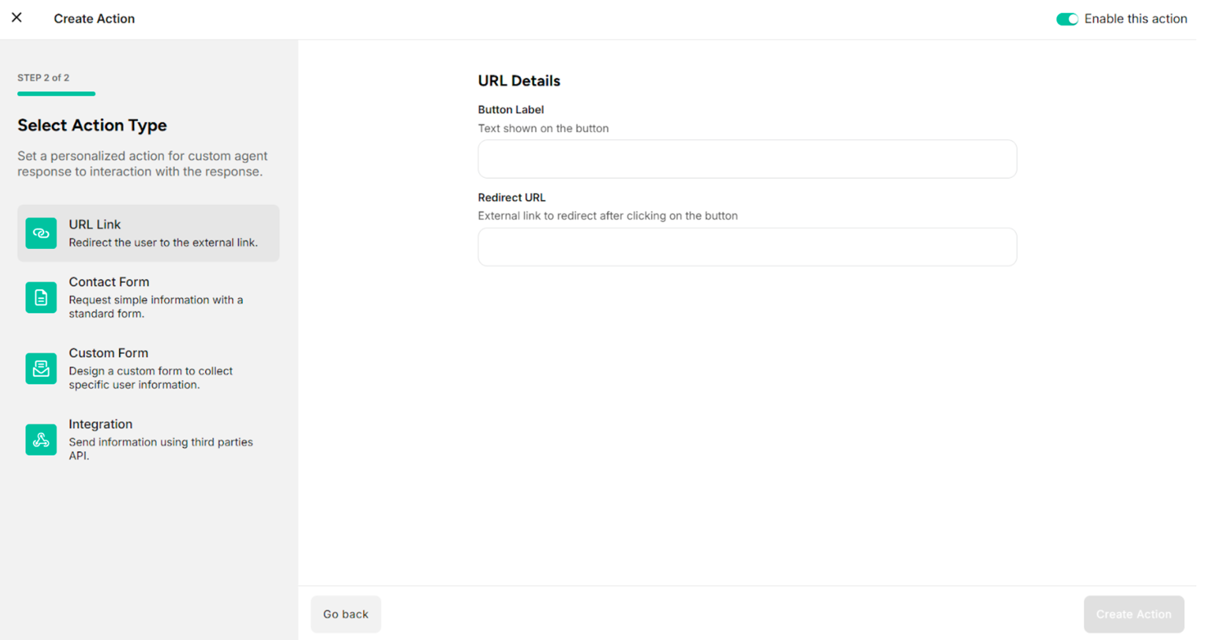
1. URL Link
| Fields/Button | Description |
|---|---|
| Button Label | Provides the label of the button to display on the action button in the user interface |
| Redirect URL | Provides the desired URL link |
| Go Back | Returns to Step 1 of custom action creation |
| Fields/Button | Description |
|---|---|
| Active (Toggle switch) | Enables or disables the configured URL Link custom action |
| Edit Icon | Manages the configured URL Link custom action |
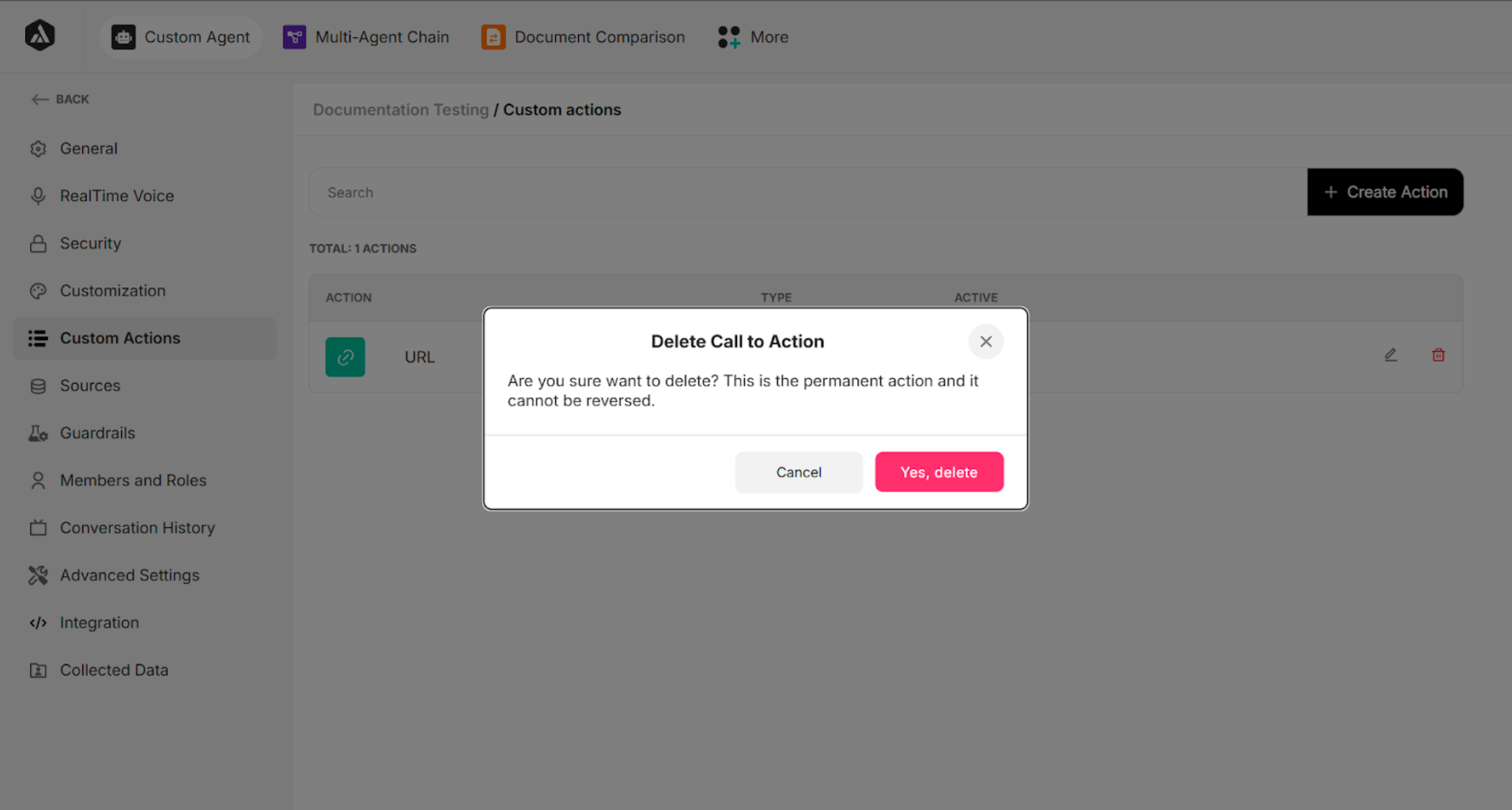
| Delete Icon | Deletes the configured URL Link custom action |
| Save Changes | Saves the updates of the configured URL Link custom action |
2. Contact Form
The Contact Form custom action consists of three main sections.
| Sections | Description |
|---|---|
| Form Details | Provides general information about the contact form action |
| Form Fields | Uses the predefined input fields that will be displayed to users |
| Integration | Configures the API call that will be triggered when the form is submitted |
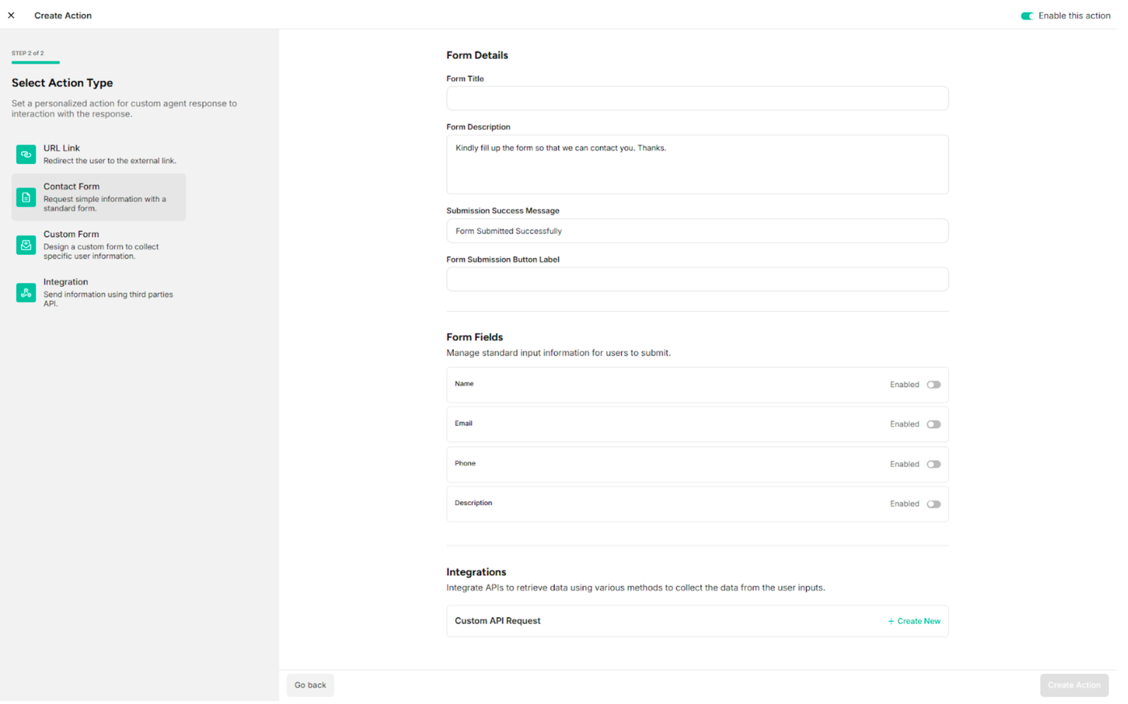
2.1. Form Details
| Fields | Description |
|---|---|
| Form Title | Provides the title of the contact form |
| Form Description | Provides the description of the contact form |
| Submission Success Message | Provides the submission success message of the contact form |
| Form Submission Button Label | Provides the label of the button to display on the action button in the user interface |
2.2. Form Fields
The contact form includes four predefined fields:
- Name
- Phone
- Description
2.3. Integration
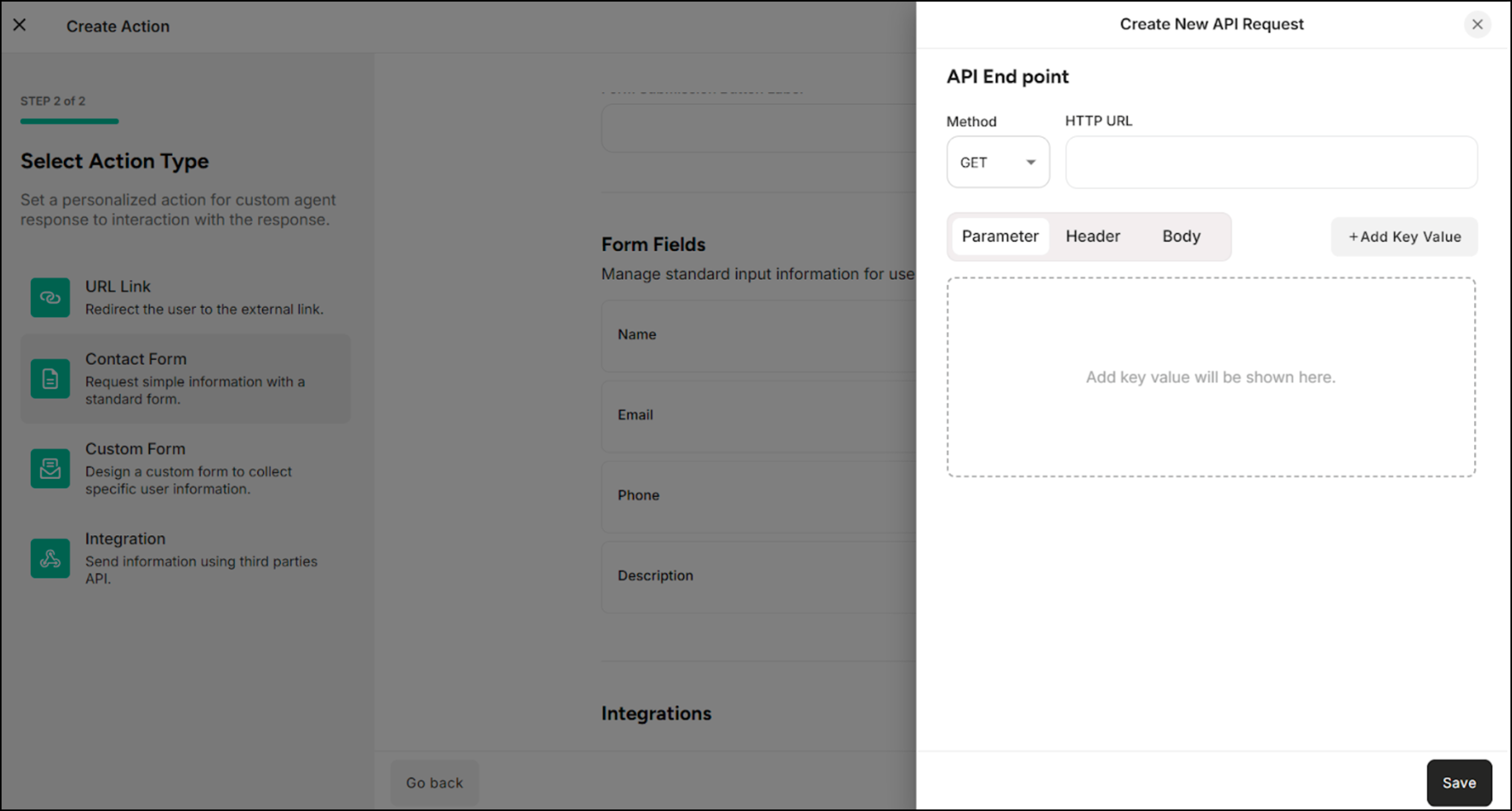
The API Request defines how form data is sent to an external system when the contact form is submitted.
| Methods/Components | Description |
|---|---|
| GET | Retrieves data from the external system or server |
| POST | Sends data to the external system or server |
| Parameter | Filters, searches, or passes simple data to the external system or server |
| Header | Provides additional information required by the external system or server to correctly process the request |
| Body | Sends structured data, such as form submissions or JSON objects |
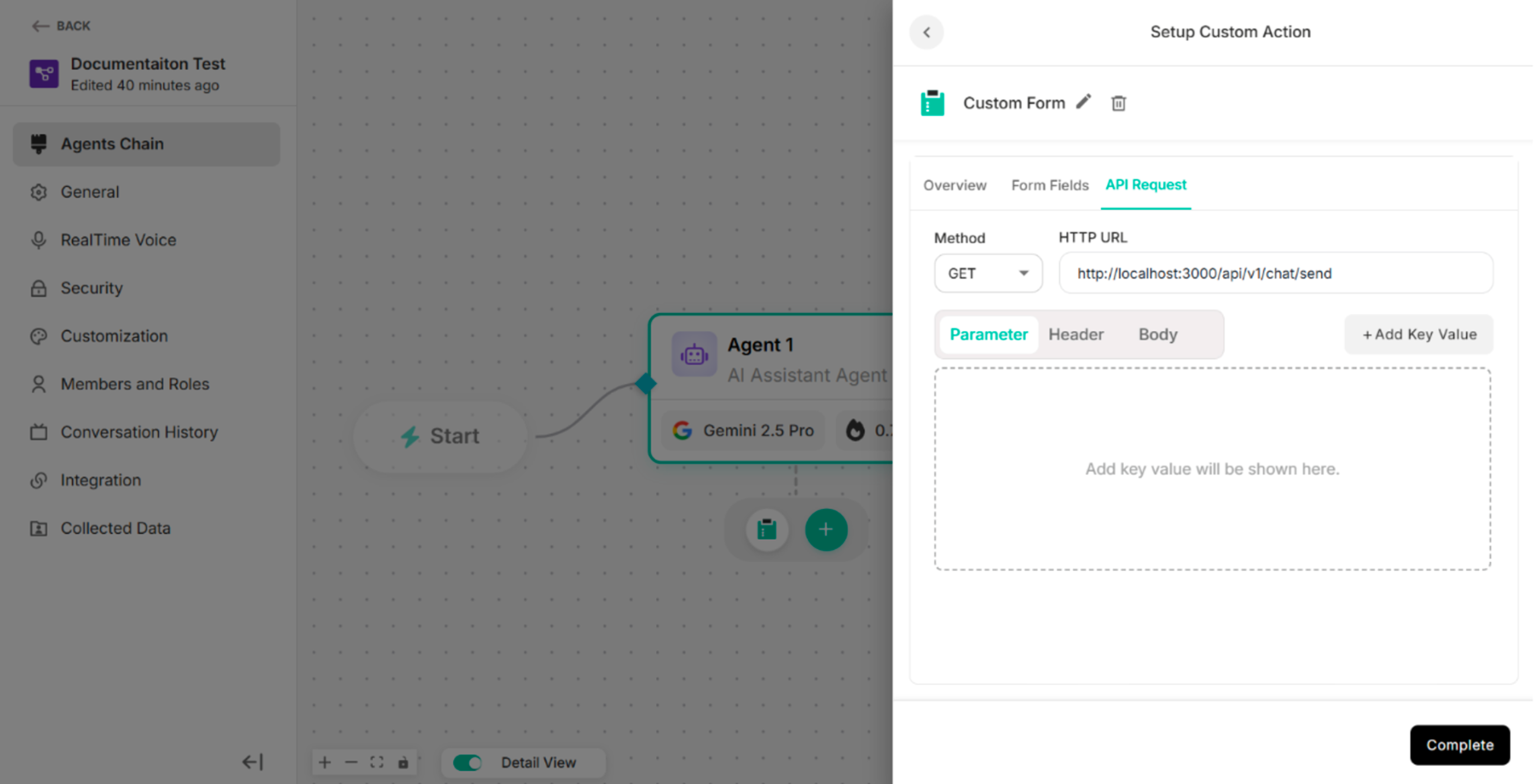
3. Custom Form
The Custom Form custom action consists of three main sections.
| Sections | Description |
|---|---|
| Basic Information | Provides general information about the custom form action |
| Custom Form Fields | Adds the custom input fields that will be displayed to users |
| Integration | Configures the API call that will be triggered when the form is submitted |
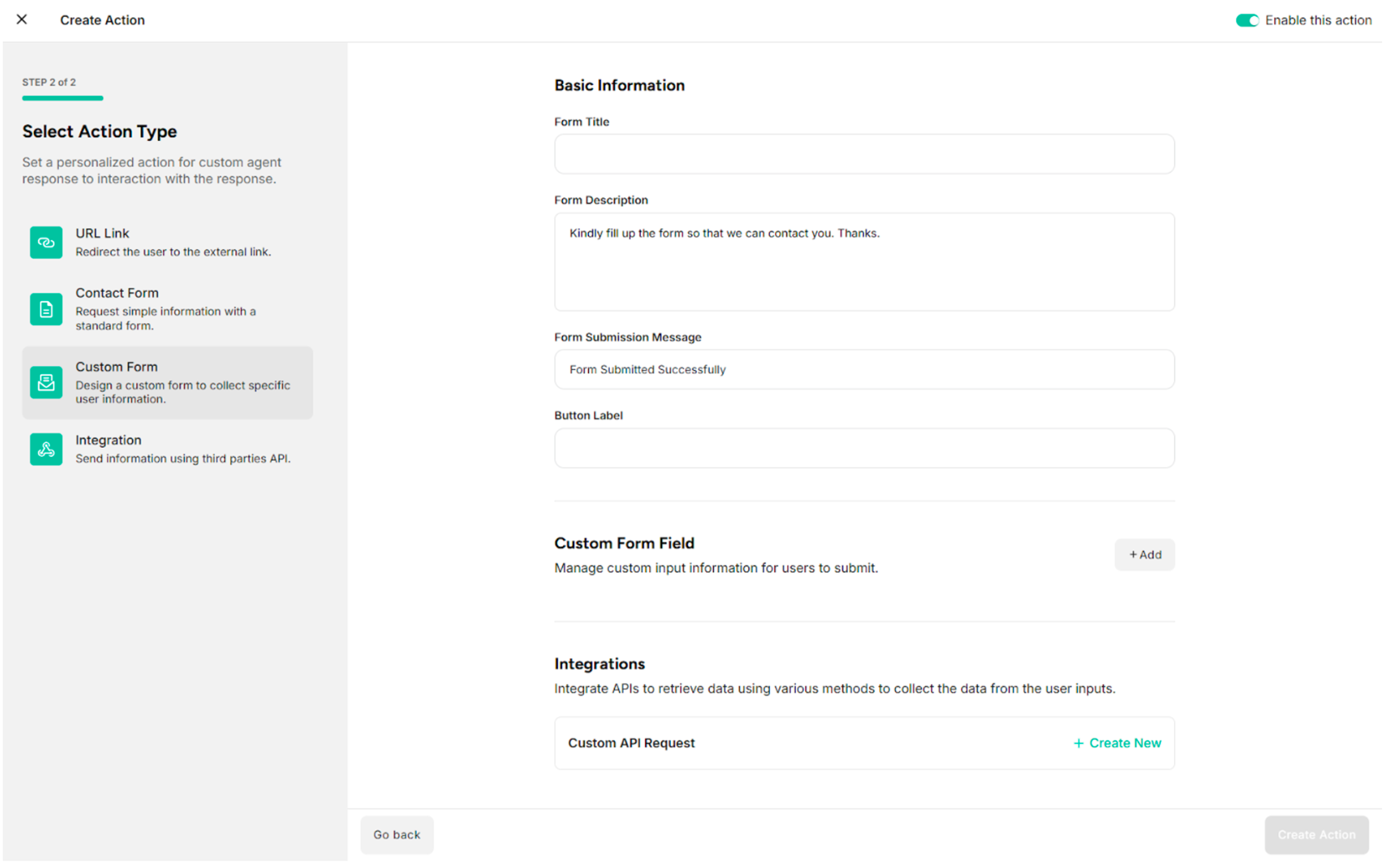
3.1. Basic Information
| Fields/Button | Description |
|---|---|
| Form Title | Provides the title of the custom form |
| Form Description | Provides the description of the custom form |
| Form Submission Message | Provides the submission success message of the custom form |
| Button Label | Provides the label of the button to display on the action button in the user interface |
3.2. Custom Form Fields
| Button | Description |
|---|---|
| + Add Field | Adds the custom form fields |
Table: Button in the Form Fields
Step 1: Click +Add in the Custom Form Fields of Custom Action The system displays the added form field.
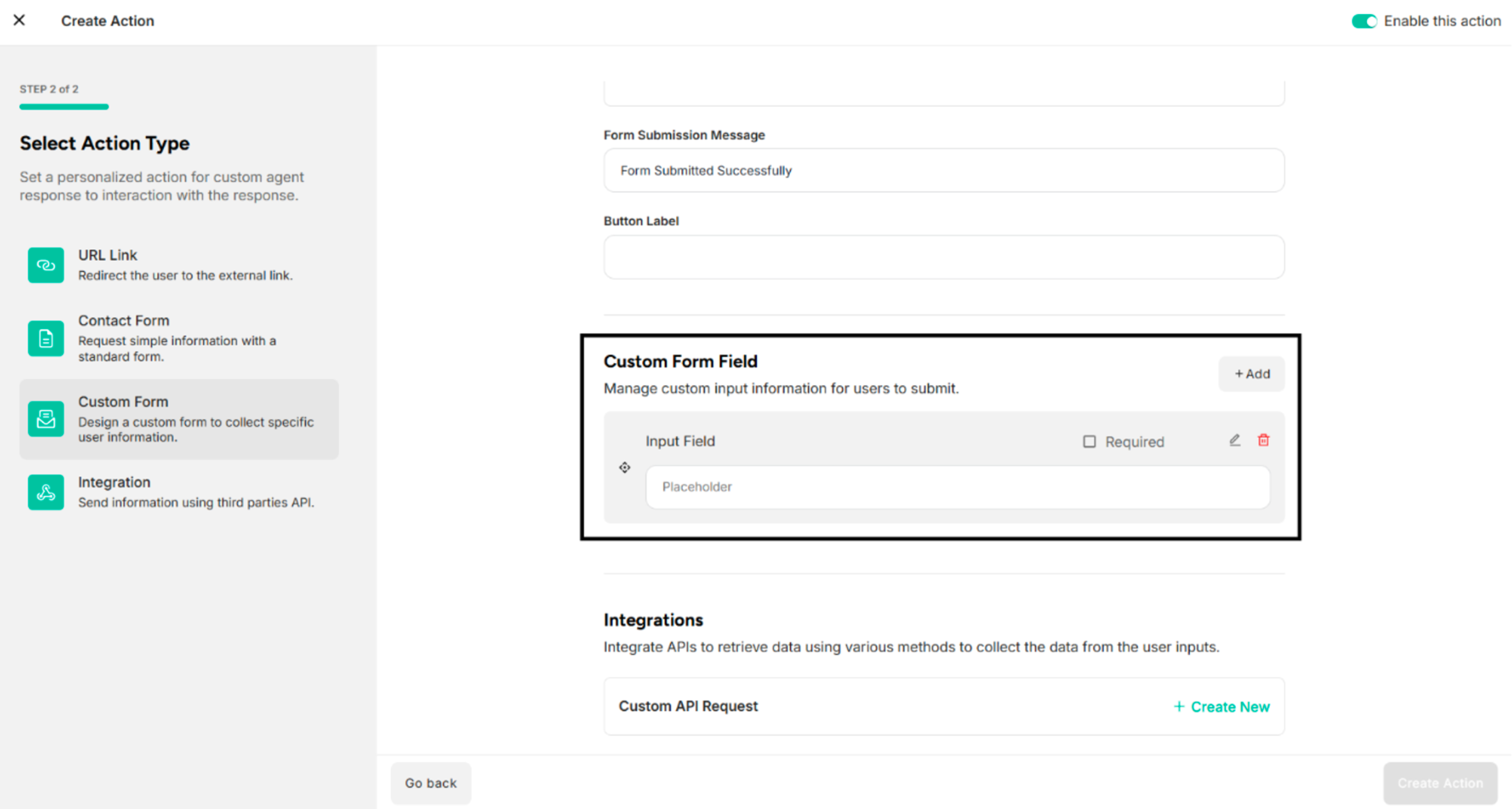
| Icons | Description |
|---|---|
| Check Box Icon for Required | Defines whether the field is mandatory or optional |
| Edit Icon | Edits form fields |
| Delete Icon | Deletes the added form fields |
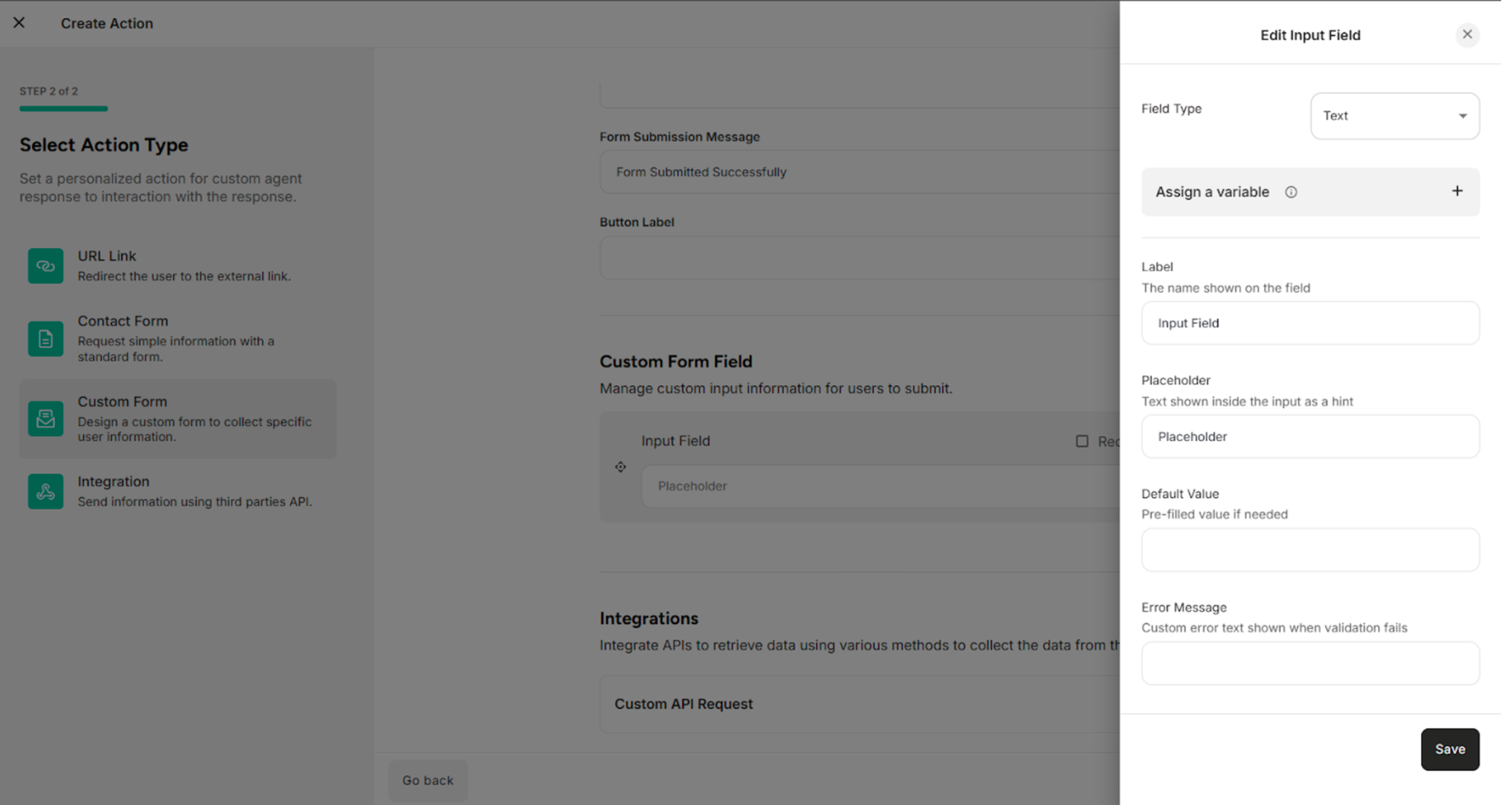
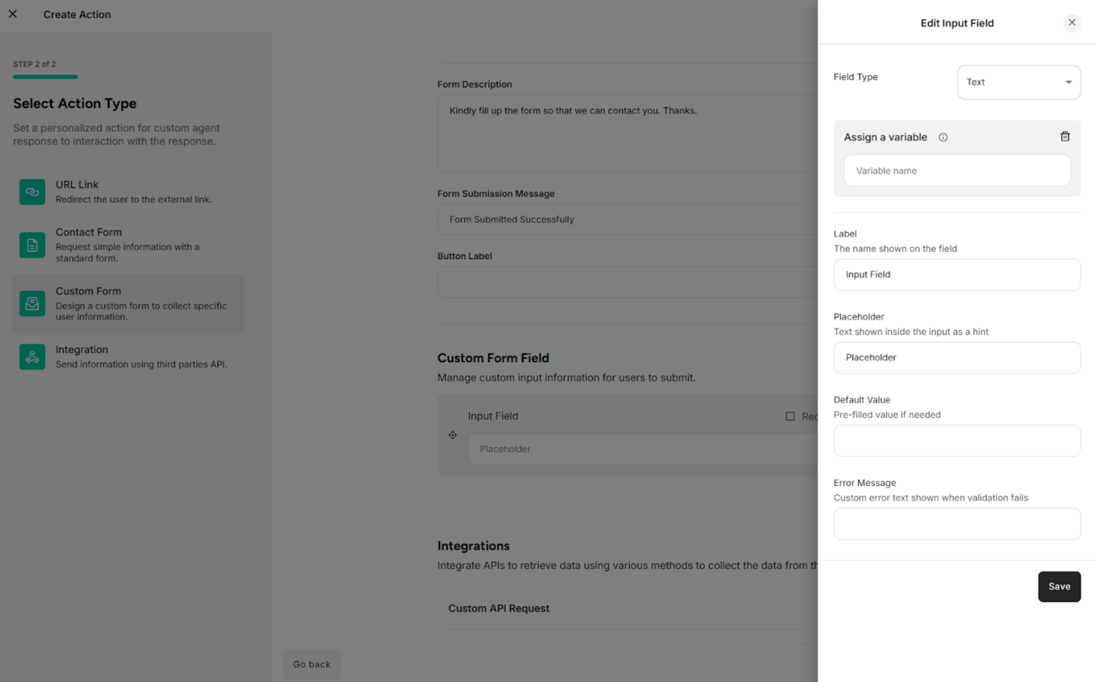
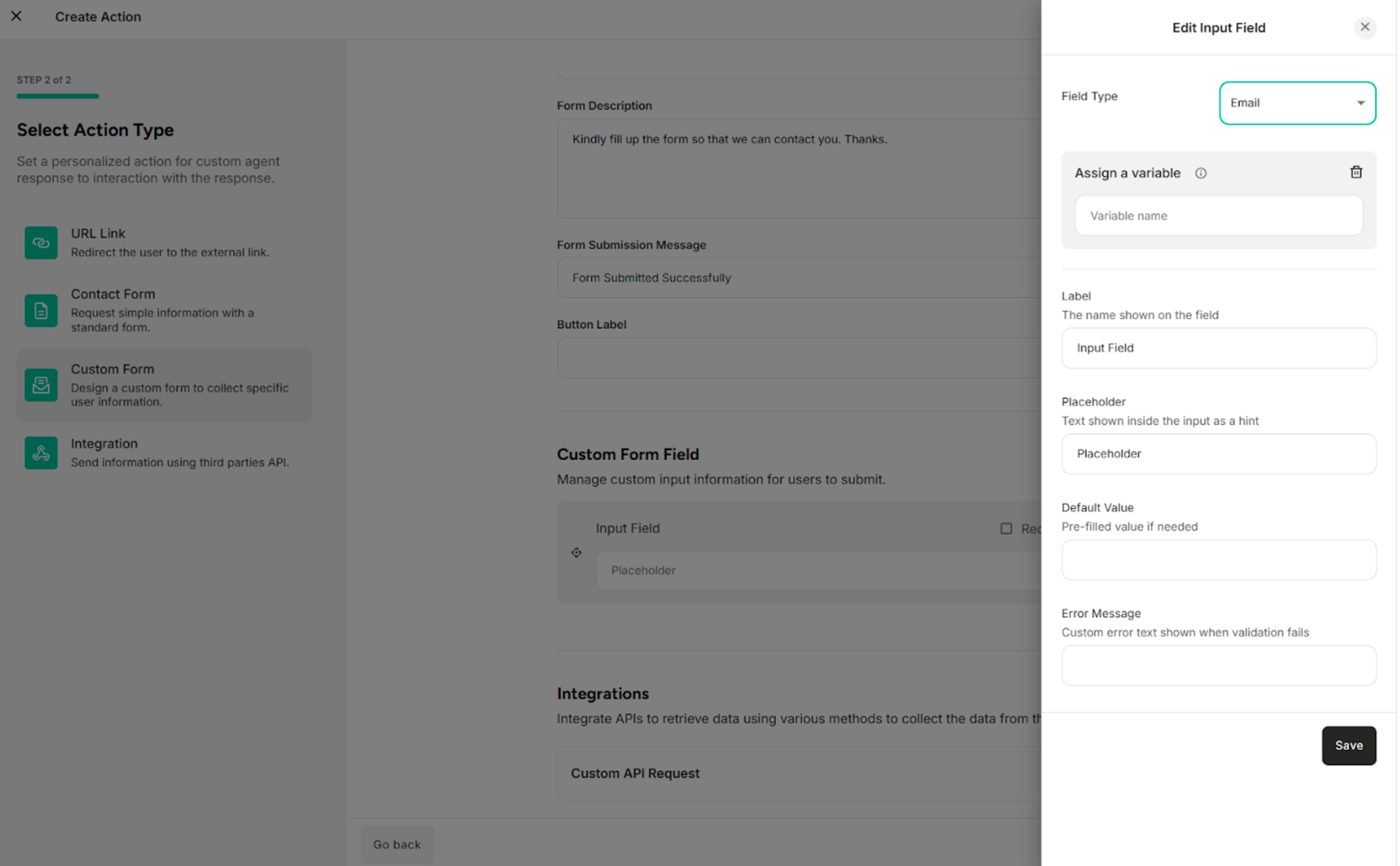
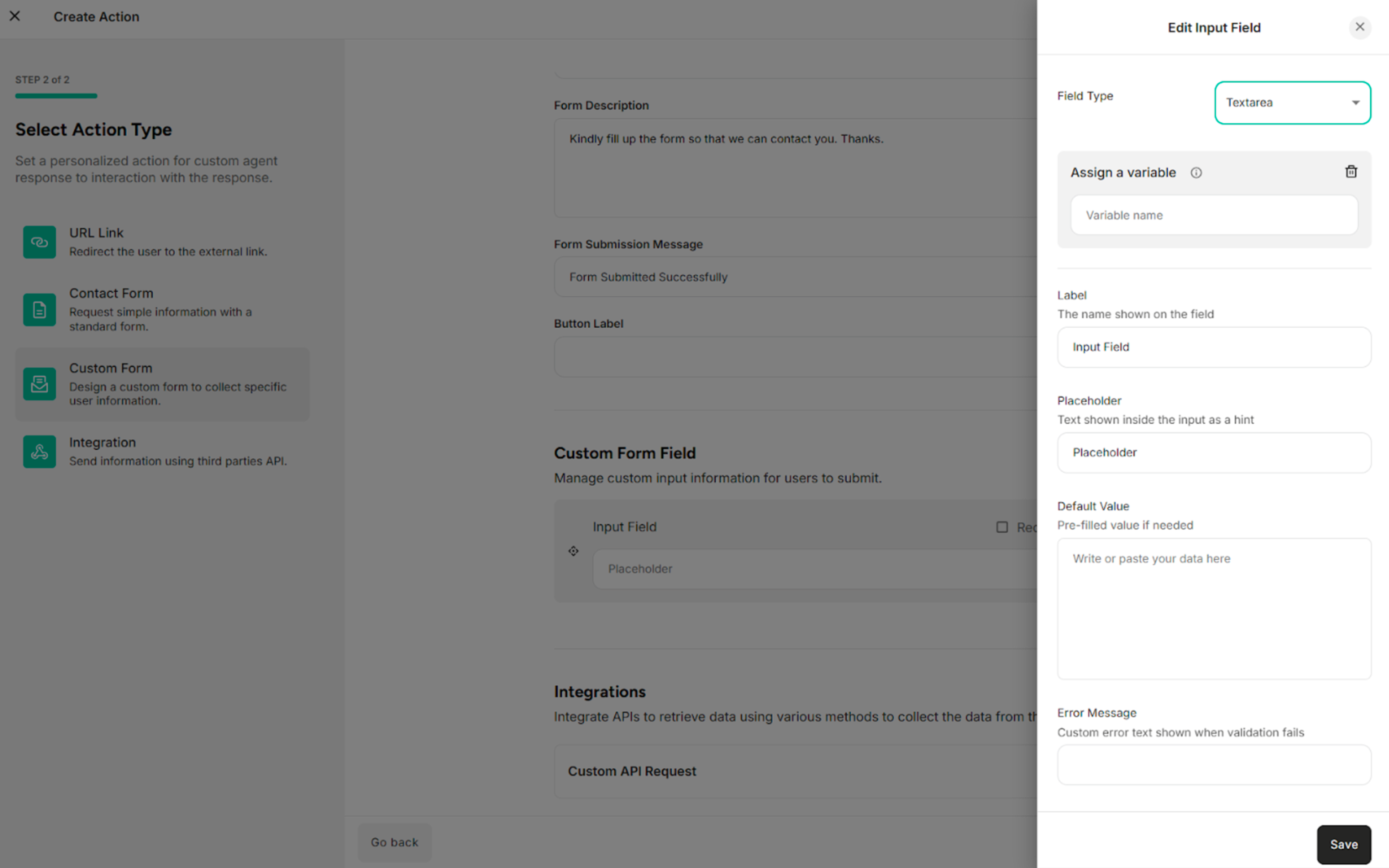
Step 2: Click Edit Icon on the added form field The system shows the Edit Form Field pop-up.
| No | Field Type |
|---|---|
| 1. | Text |
| 2. | |
| 3. | Phone |
| 4. | Number |
| 5. | Text Area |
| 6. | Dropdown |
| 7. | Checkbox |
Table: Field Types Available in the Edit Form Field
| Buttons | Description |
|---|---|
| Save | Saves the update or edit information in the edit form field |
| Cross icon | Cancels the form field editing process |
For Text Field Type:
| Fields | Description |
|---|---|
| Field Type | Selects the type of input field (e.g., Text, Number, Email) that determines how data is entered and validated |
| Label | Defines the display name of the form field shown to end users |
| Placeholder | Specifies the hint text displayed inside the field to guide users on what to enter |
| Default Value | Sets a pre-filled value that appears in the field when the form is loaded |
| Error Message | Provides the error message |
For Email Field Type:
| Fields | Description |
|---|---|
| Field Type | Selects the type of input field (e.g., Text, Number, Email) that determines how data is entered and validated |
| Label | Defines the display name of the form field shown to end users |
| Placeholder | Specifies the hint text displayed inside the field to guide users on what to enter |
| Default Value | Sets a pre-filled value that appears in the field when the form is loaded |
| Error Message | Provides the error message |
For Phone Field Type:
| Fields | Description |
|---|---|
| Field Type | Selects the type of input field (e.g., Text, Number, Email) that determines how data is entered and validated |
| Label | Defines the display name of the form field shown to end users |
| Placeholder | Specifies the hint text displayed inside the field to guide users on what to enter |
| Default Value | Sets a pre-filled phone number that appears in the field when the form is loaded |
| Error Message | Provides the error message |

For Text Area Field Type:
| Fields | Description |
|---|---|
| Field Type | Selects the type of input field (e.g., Text, Number, Email) that determines how data is entered and validated |
| Label | Defines the display name of the form field shown to end users |
| Placeholder | Specifies the hint text displayed inside the field to guide users on what to enter |
| Default Value | Sets a pre-filled value that appears in the field when the form is loaded |
| Error Message | Provides the error message |
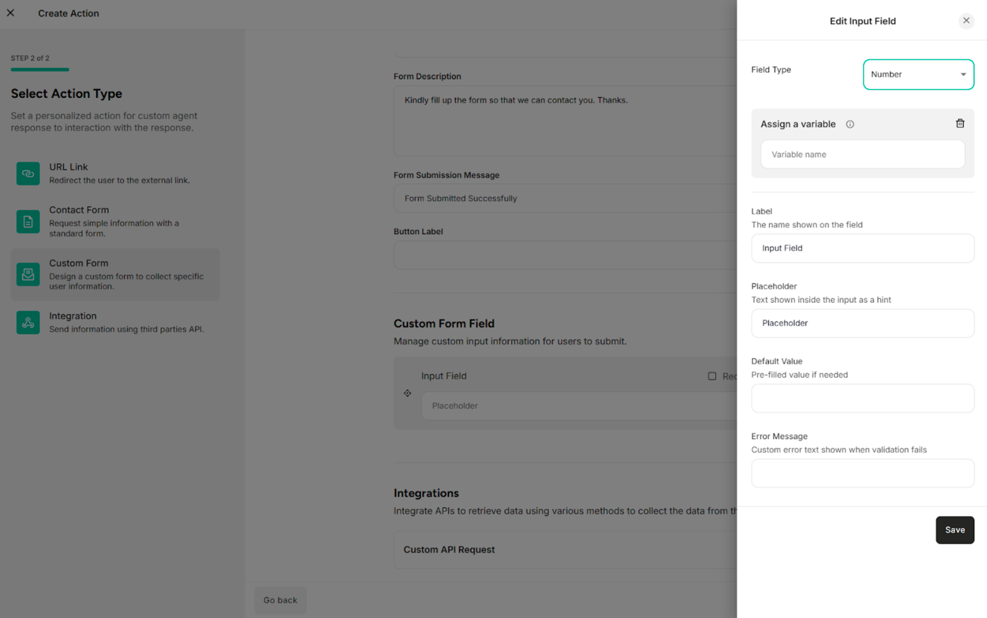
For Number Field Type:
| Fields | Description |
|---|---|
| Field Type | Selects the type of input field (e.g., Text, Number, Email) that determines how data is entered and validated |
| Label | Defines the display name of the form field shown to end users |
| Placeholder | Specifies the hint text displayed inside the field to guide users on what to enter |
| Default Value | Sets a pre-filled value that appears in the field when the form is loaded |
| Error Message | Provides the error message |
For Dropdown Field Type:
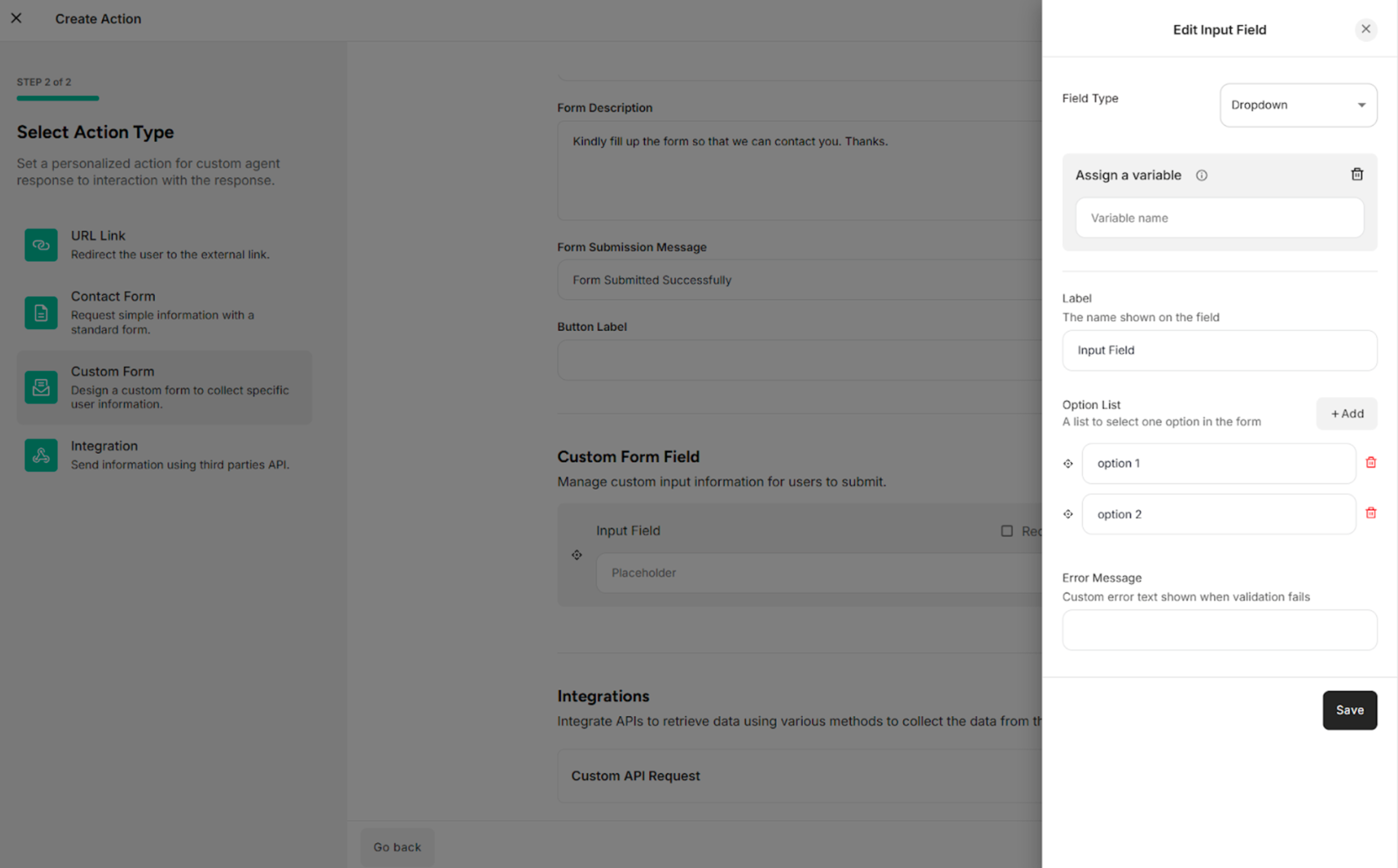
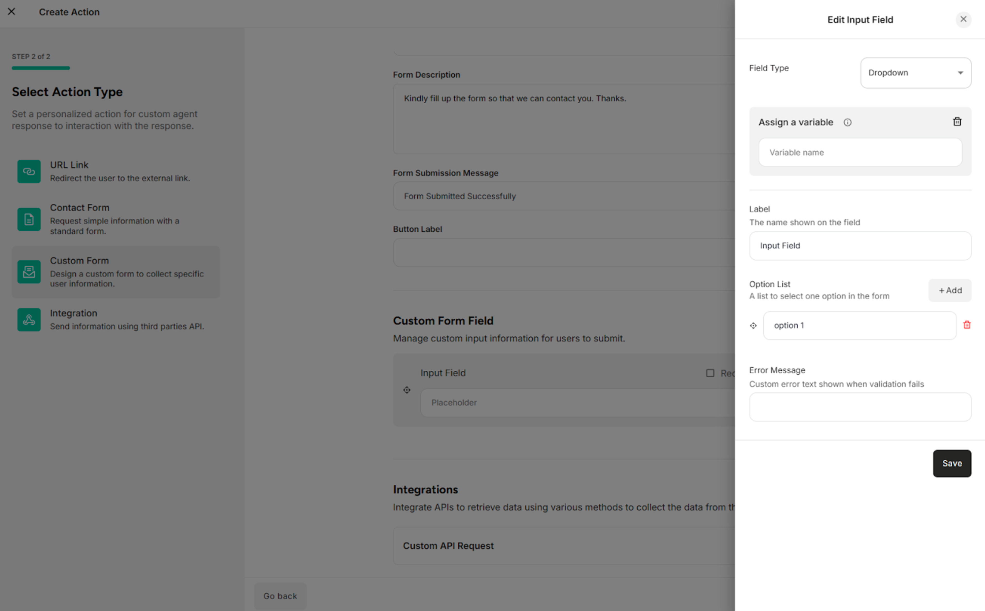
| Fields/Button | Description |
|---|---|
| Field Type | Selects the type of input field (e.g., Text, Number, Email) that determines how data is entered and validated |
| Label | Defines the display name of the form field shown to end users |
| Option List | Selects one option in the custom form |
| Error Message | Provides the error message |
| +Add | Adds the option list |
| Delete Icon | Deletes or removes the option list |

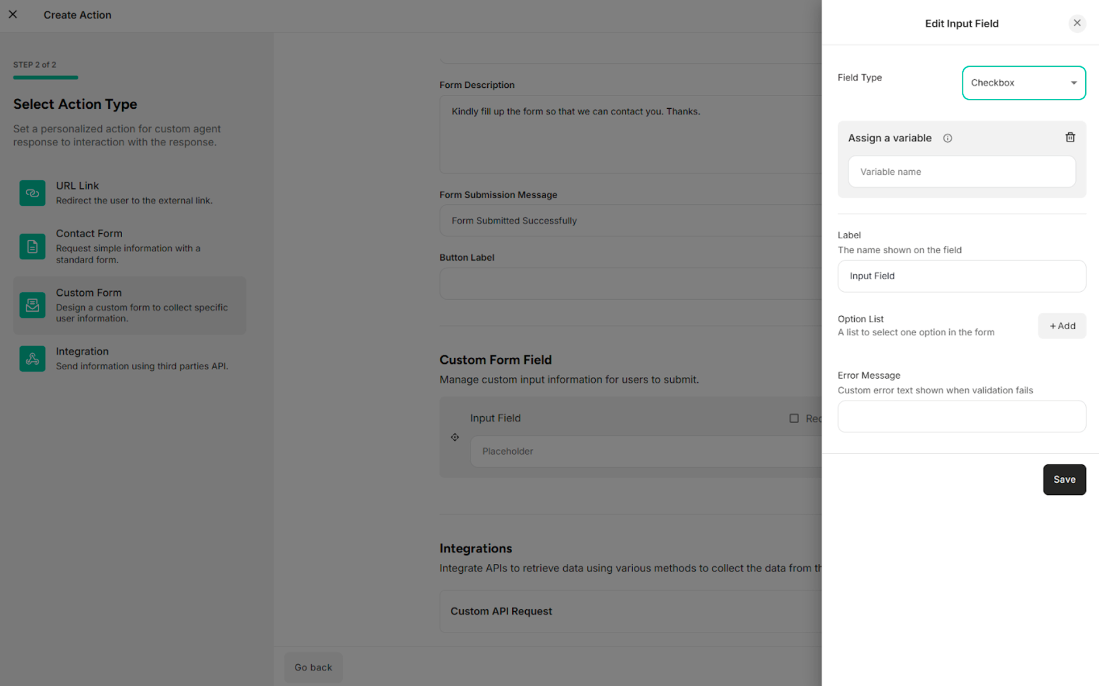
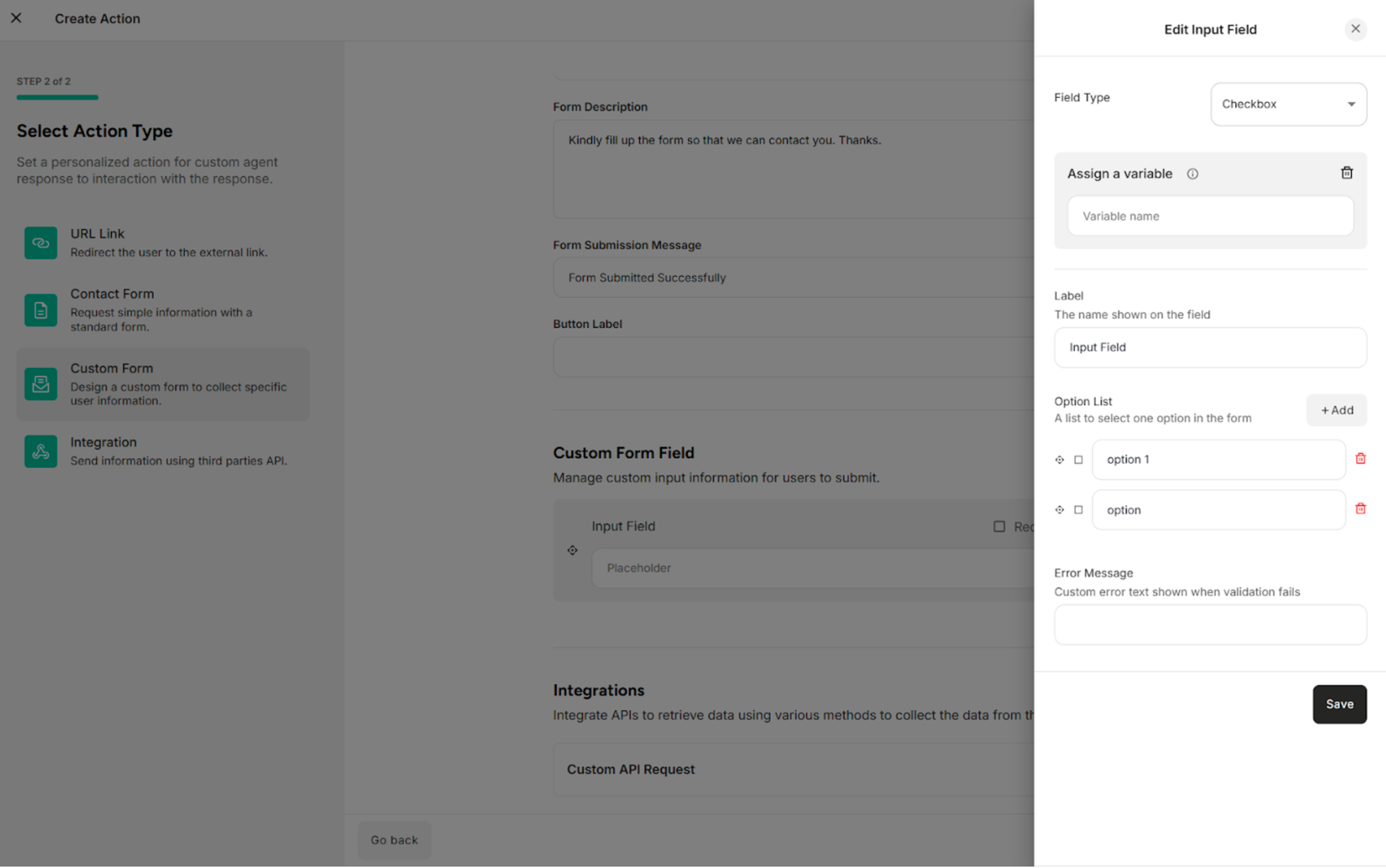
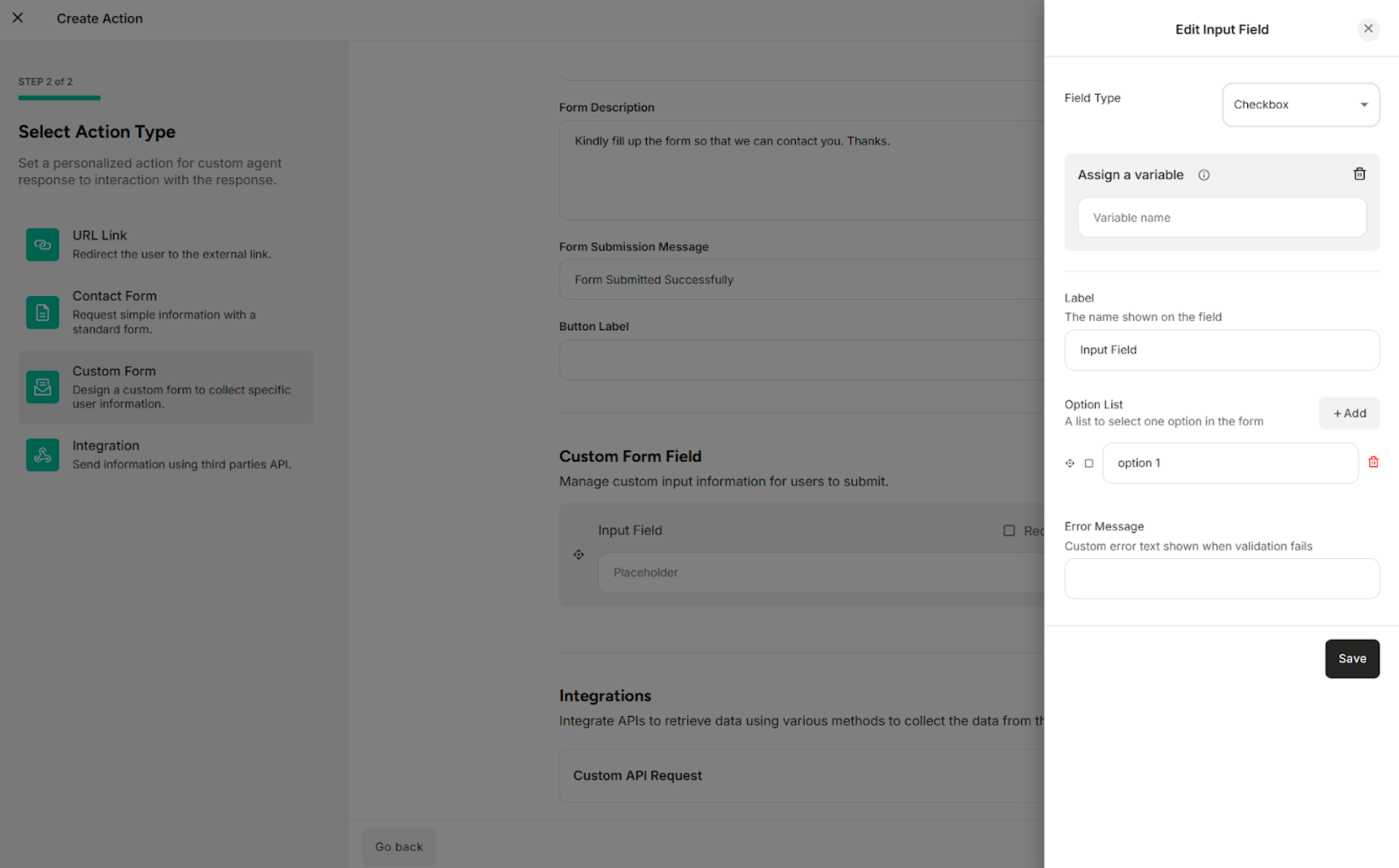
For Checkbox Field Type:
| Fields/Button | Description |
|---|---|
| Field Type | Selects the type of input field (e.g., Text, Number, Email) that determines how data is entered and validated |
| Label | Defines the display name of the form field shown to end users |
| Option List | Selects one option in the custom form |
| Error Message | Provides the error message |
| +Add | Adds the option list |
| Delete Icon | Deletes or removes the option list |
3.4. Custom Form Integration
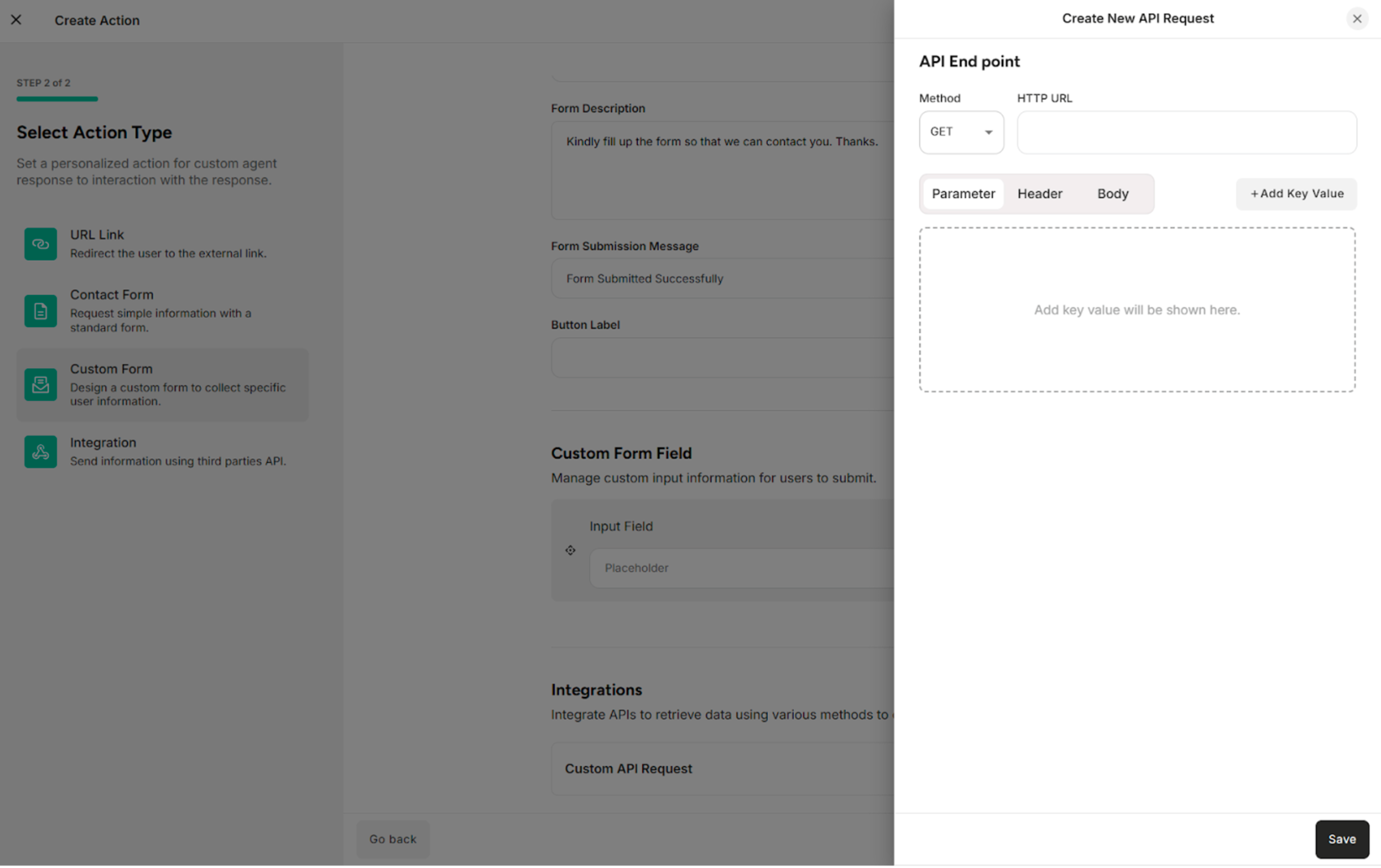
The API Request defines how form data is sent to an external system when the custom form is submitted.
| Methods/Components | Description |
|---|---|
| GET | Retrieves data from the external system or server |
| POST | Sends data to the external system or server |
| Parameter | Filters, searches, or passes simple data to the external system or server |
| Header | Provides additional information required by the external system or server to correctly process the request |
| Body | Sends structured data, such as form submissions or JSON objects |
4. API Integration
The API Integration defines how form data is sent to an external system when the custom form is submitted.
| Methods/Components | Description |
|---|---|
| GET | Retrieves data from the external system or server |
| POST | Sends data to the external system or server |
| Parameter | Filters, searches, or passes simple data to the external system or server |
| Header | Provides additional information required by the external system or server to correctly process the request |
| Body | Sends structured data, such as form submissions or JSON objects |